Still Life

Charcoal
Project 1
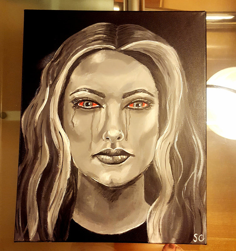
Ava
Acrylic Paint
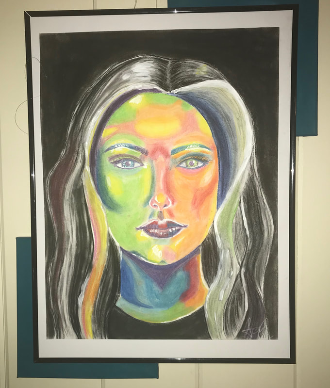
Self Portrait
When I began painting this piece, immediately I felt frustrated with blending the different values of the face, as I blended more, I lost the value, and the face looked two- dimensional. I decided that I would not focus so much on blending, but rather just painting the different values on the face, figuring I could blend later. In the end I decided that not having everything blend together perfectly made the face more interesting to look at, and actually made the face look more three- dimensional. I feel that this was a technique that I mastered. I struggled with the hair in this piece. When I originally painted the hair, I wanted to make it look realistic, ultimately it ended up looking too streaky and it overwhelmed the face. I repainted it so that it would look simpler. I still feel that is an area that I can improve upon in the future. I did not use any other artists' artwork as inspiration for my piece. I did use my charcoal self portrait from last year to help paint my face for this project. For this painting I began by measuring where the facial features would go and then began to paint the different values in the face. As previously mentioned, I originally struggled with this, until I focused on making it less perfect and more interesting. I wanted to make the eyes red because I wanted to draw the focus to them. I knew that I would have her crying in the painting and I wanted that to be the focus. If I were to do something over I would re-do the hair. I wanted this piece to be very intense, and I wish the hair would have looked, angrier. I would have added in more curls and made it look bigger, but I would still need to be careful not to overwhelm the face. This piece is quite different from my pieces last year. Last year my theme was pop culture, so most of pieces revolved around something I had seen on social media. This year I wanted to make my artwork more personal and have my art reflect my emotions.
Acrylic Paint
Self Portrait
When I began painting this piece, immediately I felt frustrated with blending the different values of the face, as I blended more, I lost the value, and the face looked two- dimensional. I decided that I would not focus so much on blending, but rather just painting the different values on the face, figuring I could blend later. In the end I decided that not having everything blend together perfectly made the face more interesting to look at, and actually made the face look more three- dimensional. I feel that this was a technique that I mastered. I struggled with the hair in this piece. When I originally painted the hair, I wanted to make it look realistic, ultimately it ended up looking too streaky and it overwhelmed the face. I repainted it so that it would look simpler. I still feel that is an area that I can improve upon in the future. I did not use any other artists' artwork as inspiration for my piece. I did use my charcoal self portrait from last year to help paint my face for this project. For this painting I began by measuring where the facial features would go and then began to paint the different values in the face. As previously mentioned, I originally struggled with this, until I focused on making it less perfect and more interesting. I wanted to make the eyes red because I wanted to draw the focus to them. I knew that I would have her crying in the painting and I wanted that to be the focus. If I were to do something over I would re-do the hair. I wanted this piece to be very intense, and I wish the hair would have looked, angrier. I would have added in more curls and made it look bigger, but I would still need to be careful not to overwhelm the face. This piece is quite different from my pieces last year. Last year my theme was pop culture, so most of pieces revolved around something I had seen on social media. This year I wanted to make my artwork more personal and have my art reflect my emotions.
Project 2

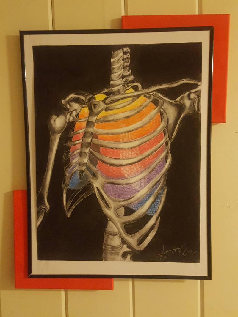
Knowing
Charcoal
Still Life
For this piece I focused a lot on the shading. I wanted to make the heart look as realistic as possible. I think there are places in the pieces where my shading helped to do this, but there are also places where I could have shaded more and made the heart more dramatic. For this piece I did not use any other artists as inspiration. For this project I began by finding pictures of hearts and taking different elements from each picture to draw the heart using a grid. Once I had an outline of heart I began to add shading using willow charcoal. From there I continued to add shading and highlights using darker charcoal and white charcoal. For each of pieces this year I want add in a new color for each piece. For this piece I added light and dark blue into some of the shading. I incorporated the red from my previous piece into the veins of the heart. If I were to do something over I would redo the background. I don't like the white around the heart, I think it draws attention away from the veins, which was the intended focus of this piece. I'm not quite sure how I would do the background instead I still need to experiment with some new ideas.
Project 3 Check In

|

|
My third project is almost finished. I have completed the hands, all that I have left to do is find a stand to set the hands on and add the blood. It took a couple tries to get the hands right. I created a mold of my own hands using alginate and then created the hands with plaster. Unfortunately, because the plaster was delicate, the first couple times I tried to take the hands out the mold, some of the fingers would break off. I tried different ways of painting the hands as well. Originally, I wanted to try to use different shades of grey to create dimension within the hands. However, after experimenting with this I decided it ultimately would distract from the glass and blood, and also looked to messy. Instead I spray painted the hands black to keep them simple but still looking finished. My plan for this year is to add new color to each project. For this piece I added in purple. The glass is both purple and blue and the red will come in with the blood. In the pictures, you can see that I have began to experiment with different ways to do the blood. I haven't found a method that I like yet but I have several more ideas which I want to experiment with.
Project 3

|

|
Break
Spray Paint, Acrylic Paint, Glass, and Plaster
Childhood to Adulthood
For this piece originally I struggled with created the hands. The first couple times I tried to make them, the fingers would break off as I took the hands out of the mold. This was because there were too many air bubbles in the plaster. For my final version of the hands I would shake the bucket to release the air bubbles. I used my first couple of hands to experiment with different ways to paint the hands. Originally, I worked with different shades of grey to try and add shading and highlights. Ultimately, I decided this made the hands look too busy. I was have difficulty getting the paint to blend well. Since the hands are already three dimensional, the different shades of grey did not really add to them. I decided it would be better to keep the hands simple, so they would not distract from the glass or the blood. I used black spray paint to color the hands. I chose spray paint over acrylic because I wanted the hands to be slightly glossy. I also tried several different ways to create the blood. I tried to just use acrylic paint, but it was too thick to drip. I tried to add paint to clear glue but the two did not blend well together, the mixture did not dry. I mixed acrylic paint and water to create the blood for the project and I think it created a really interesting look. The only that I would change about this project is that I wanted the blood to look more wet. I might experiment with this and see if I can make it look that way. For all my projects this year I have been adding in a new color to each project. For this piece I added in purple with the glass.
Project 4

Chanel N5
Acrylic Paint
Still life
This piece I did as a side project for a friend. I took inspiration from a piece I did last year of another Chanel bottle. For this piece I did the background different from the previous one. I kept the darker shades in the middle, as opposed to the top of the canvas. I usually would not have picked pink, but my friend requested that I use it. I think the bottle could look more three dimensional. The main problem that I found is that because I kept the bottle clear it does not stand out as much as it could from the background. I added a little bit of very thin paint to the bottle to try and distinguish the bottle from the background. I did not want to add too much paint though because I was worried that it would not similar enough to the painting my friend had wanted me to copy. I chose to add blue to the piece because I did not want the piece to be too "feminine". My friend wanted this painting because of a song called "Chanel", which is about the singer embracing his bisexuality. I used both the blue and pink to represent this. This piece does not connect to any of my other pieces from this year.
Project 5

Smoked
Acrylic, Spray Paint
For this piece, I had to use a lot of dramatic shading. I think there were areas where this was successful, the arm, hand, torso and chest. But, the shading in the neck and face was difficult. I based this painting of off a photograph of a dancer. This made the body particularly defined. The face and neck are in such a dramatic position, so the shading was really important to convey this. Picasso’s Guernica had a great impact on me. The rawness and emotion of the piece was evident. I thought it was important that I challenge myself in order to improve as an artist. . I used the person on the far right in Guernica, with their head thrown back as inspiration for this piece. My idea for this piece stayed the same throughout the process. I knew where I wanted to place the colors and I always had they idea in my head for how the person would look. I orginally planned to use acrylic paint for the smoke, but I found that spray paint created a more a realistic look. In the photograph, the person was wearing clothes. I made the the decision to have the subject naked because I thought it put the person in a more vulnerable position. There isn't anything about this piece I would redo. This piece links to my other pieces through the use of color.
Project 6
Resuscitate
Charcoal, Chalk Pastel
I think I really mastered the use of charcoal in this piece. I think with struggled slightly with the chalk pasterl, only because the lungs look less three dimensional. I did not draw inspiration from any other artists. This piece is the turning point in my show, which is why I chose to use a lot of color. Rather than focusing on something negative, I wanted to show the process of overcoming this and rebuilding what had been broken. Using the idea from my previous piece of choking on smoke, I wanted the color to represent air coming into the lungs. If I were to do something over, I think I would spend more time on the lungs, to make them look more three dimensional. I really did not want to use that much charcoal in lungs, especially the one on the right, because I wanted them to be colorful. This piece connects to the rest of my pieces through the use of color and bodies.
Project 7
Open
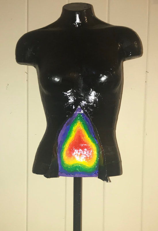
Spray Paint, Acrylic, Paper Mache
I think mastered the paper mache of this piece, There weren't really any techniques that I struggled with, because this piece was fairly easy. For this piece I wanted to build off of my previous piece, ribs protect our heart and lungs. In this piece I chose to highlight the stomach because it is unprotected to showcase the idea of vulnerability and opening yourself up. I didn't draw inspiration from any other artists. I used thermal imaging scans as inspiration for the color. I struggled with the shape of the color on the stomach. I had to go back and redo it several times so the paint would blend and the shape was more neutral. If I could redo anything about this piece I would make the colorful part bigger. This piece connects to my other piece through color and bodies.
Project 8
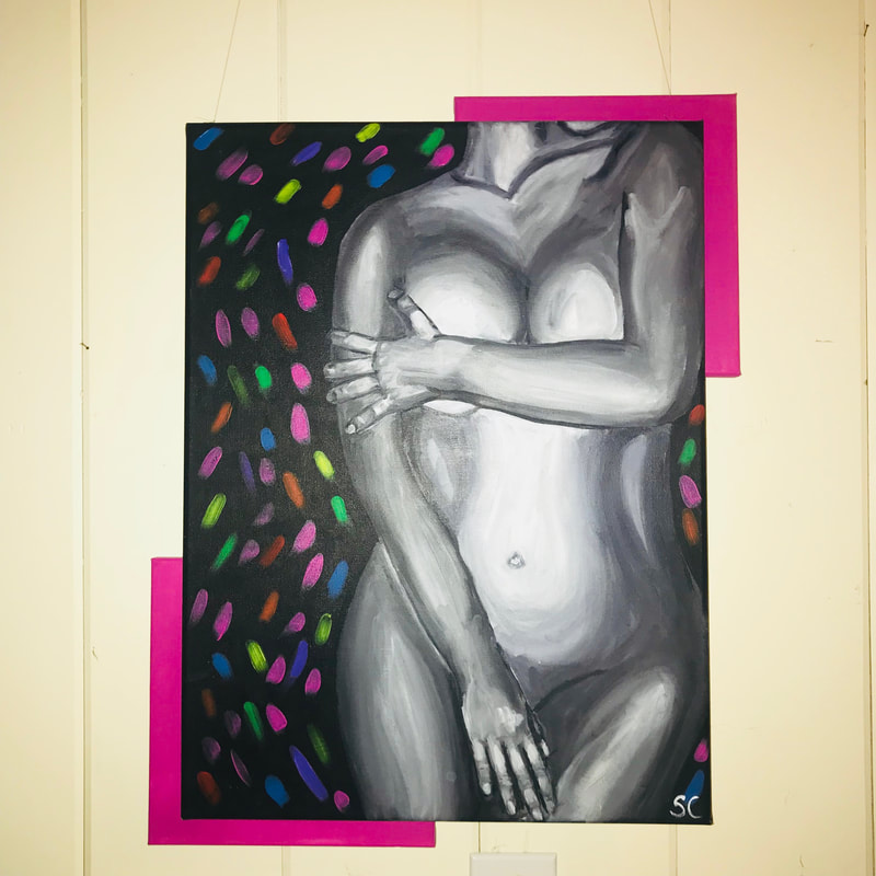
First
Acrylic Paint
I think that I struggled and mastered the shading of this piece. The shading of this piece is different from my other pieces, it is more blended. I think the stomach, in this picture looks too light. I did not have any artists as inspiration for this piece. The woman in this piece is nude, which can be a very vulnerable place to be. I used the colorful background to convey the idea of feeling safe, despite the vulnerability.When I started this piece the body was more to the right. I moved the body over so it would be less centered on the canvas. I do not really like the back ground of the piece. I like how the color surrounds the body but I don't know if I like the dots. It's something I might redo. This piece, like all my others had a new color brought in and features a body.
Project 9
Repair
Charcoal, Chalk Pastel, Acrylic
This piece was the hardest one I worked on. I wanted my show to start and end with two very different self portraits. For this one, it was hard to take the different shades of grey from the first one and transform them into the colors used in this one. I think this technique is something I would like to explore more in the future. I used tracing paper to trace my first piece so I could translate it to the paper for this piece. I tried to focus on the shadows and highlights from the first piece and use the fitting color. There are several aspects of this face I would redo, the nose, lips, and the space between them. I think highlights and shadows could also be helpful to make the face look more three dimensional.
